Danger's Art Pad

Saturday, December 17, 2011
20 Minute Skull study
This was a really quick light study I did last night while watching "Cat on a Hot Tin Roof" with my girlfriend Angela. I did it over an old color comp, 8"x10" on masonite. I'd been wanting to paint the neat little ceramic skulls Ang bought for me last Halloween, so I covered my desk lamp with yellow felt and gave it a shot. This most likely will not be the last color sketch I put up with these little guys.Though the light side of the skull looks like a cold yellow green, I used only Cadmium yellow and white. The old painting underneath was a mostly green composition, and my thin painting allowed the colors underneath to show through, creating the glowing green effect. It was also quite an adventure trying to mix correct colors in a relatively dark room, my main light being bright yellow. Good practice, though SPpOOooooooooOOKKY!
Thursday, December 15, 2011
Illustration 2 Final Project
The final project in Bob Barrett's oil painting class was to create an image with at least one figure, somehow interrupted by another element of the composition, based off of the Golden Mean and executed with a split complimentary pallet. After much hemming and hawing, I came up with this idea. I really love old mens' adventure magazine illustration, so I went into this with the conceptual and technical spirit of Joe Bowler and Basil Gogos. My buddies Charlie and Ian were nice enough to be my models, and props from the BYU production of "The Elephant Man" provided scenery. The color and quality of the top image (of the finished painting) leave a bit to be desired, but I had to turn the painting in this morning, so I'll replace it with something a little more true to the painting as soon as possible. The bottom three images are all 8"x10", with the final piece at roughly 17"x25". I trimmed a little off the right edge in the final composition, as well as trading in a new head and dropping some detail out of the guard for the sake of atmospheric perspective. Good end to the semester.
Wednesday, December 7, 2011
Final Project for Narrative Class
Our final project in my narrative class was to create an illustration for Stowaway, a travel magazine run by BYU students. The requested illustrations were very broad, so the produced illustrations were also very broad. It was a fun project, though. This is gouache and india ink on illustration board.
Saturday, December 3, 2011
Euro Crisis Cartoon for BYU Political Review
Monday, November 14, 2011
Oil Figure study for Class
So this semester has been my first working with oils, and I really like it. I'm definitely still learning who's who and what's what, and certainly will be for the rest of my life, but I feel like I'm getting more used to the medium, and the process is slowly becoming more understandable. The figure above was painted from a live model over several sessions in the past couple weeks. The class starts at 8 am on Monday mornings, so I'm proud that any of us are producing creative images at that time (which my classmates really are). The textured masonite I experimented with on this painting and the academic-grade oil paints I'm using to learn on can be thanked for the bright glare on the background colors. There will probably be more of these to put up in the coming weeks, and there will certainly be more personal and work projects popping up in oil.
Thursday, November 10, 2011
Big Daddy Wehrmacht Projekt
Monday, October 24, 2011
Final Inks for Cadavro
Here's what I'll be turning in for the Cadavro cover project. I'm thinking of doing a wash to get some value separation on it as well. I'm also thinking of trying a few color palettes. I'll post whatever happens.
Sunday, October 23, 2011
Behold CADAVRO!
Sunday, October 16, 2011
Ghost Stories Flyer Art
I did this really quick ink drawing (with a little fill and cleanup in paint) for the BYU Experimental Theatre Co.'s upcoming Halloween show, "Ghost Stories" last night. The project was pretty rushed, but it was fun to do, and it should be a fun show. Apparently, the audience will all be wearing blank masks like the ones in the drawing. Like I said, they needed the art in a hurry, so I just left them the black field at the bottom to insert whatever text they wanted. I think the show is playing the 27th and 29th in the Maeser Building, so anyone in Provo should go check it out. http://www.facebook.com/#!/event.php?eid=269917439715496
Friday, September 30, 2011
German Dept. Contest Entry
The German Department here at BYU is putting on an art contest in cooperation with the German consulate or something like that, which I had no plan of entering until I heard that no one had really entered it, and that the $100 cash prize or $25 university bookstore gift certificate for honorable mention were therefore pretty well within my reach. I threw this comic together quickly last night to have it in for the contest deadline this afternoon. We'll see what happens. The first frame reads "I had to drive up to Salt Lake, but finally I have it: my favorite german moldy cheese!"
Thursday, August 4, 2011
Ott Mit Uns Phase 1
This is a shirt design I've been working on throughout the summer, one of those projects that has been worked on gradually and lazily because there's no deadline. I'm crazy about the "Gott Mit Uns" (God is With Us) beltbuckles issued to German military personnel in the first and second World Wars, and I'm also crazy about Neue Sachlichkeit German artist Otto Dix. The concept of any nation engaged in a war against any other nation with both sides believing God to be on their own side has always been bizarre and fascinating to me. This drawing combines a beltbuckle design used for the SS Totenkopfverbände (Skull Units) with a piece that Dix did as one part of a 50 (or 51?) piece anti war series that Dix did in 1924. The combination of the original SS Totenkopf with the text "Gott Mit Uns" is so absurd and sickening, while Dix's "Schädel" is equally sickening, however oppositely intentioned and brilliant. I was originally going to leave the design as you see it here, but I think I'm going to add and adjust some of the ornamental elements before I call it good. Immer gegen Kriege kämpfen! I'll post the final when it's done.
Tuesday, July 26, 2011
70's Honda Sickle Tank Project
The custom paint job for the tank of my 1978 Honda cb125 is nearly complete, and let me tell you, it has been a chore. The bottom photo shows the tank as it was the night I purchased the bike: severely dented from the forks, missing some paint, faded and peeling topcoat. The middle photo is the tank after I hastily removed the stock (and terribly late 70's looking) decal from the tank and even more hastily slapped some sticky lines and lettering on as a temporary cosmetic solution. After discovering that the tank's liner was coming apart during deep cleaning of it's interior, I took it to my new friend Dan Burlick, a restorer of vintage bikes (usually much cooler ones than mine) and generally nice guy, who relined the tank and pulled the dents out of it for me. (if anyone is looking for motorcycle work like this, I highly recommend him. Get in touch with me and I'll give you his number.) After much sanding, priming, wetsanding, basecoating, and waiting, I've got the tank to this point, short just clear coat and new, more carefully painted "honda" lettering. I'll post the final when it's done.
Friday, July 15, 2011
Ramblin Rex Project Finished (Finally)
Just finished the Ramblin Rex and the Traumatones t-shirt design. That's one major check on my to-do list. Hopefully there'll be shirts of this soon.
Thursday, July 14, 2011
Monster Shirt Revival
So as some of you may know, modern graphics-based t-shirts were heavily influenced by the old 50's hot rodding tradition of airbrushed "monster shirts", pioneered and established famously by Ed "Big Daddy" Roth and Stanley Mouse at car shows on the west and east coasts, respectively. Well, being something of a purist in my enthusiasm and pursuit of ginchy old art forms and culture, I got an airbrush (it's even a Paasche, just like Big Daddy used to use!) and a compressor some time around my freshman year in college, and tried my hand at it. Similarly to my earliest attempts at brush-and-1shot pinstriping and brush-and-india ink comics, I wasn't very good, and became very frustrated. Shortly before leaving for Germany in 2007, I had only really airbrushed a small handful of times, and was very self-conscious of my as-yet unblossomed prowess with this unfamiliar medium. Starting work at Junkyard Jeans upon getting back from the Fatherland threw me right into the deep end, as I was asked to airbrush more monster shirts in the first weeks of my employ there than I had ever attempted before. This forced me to become better acquainted with the airbrush, but I still became discouraged when looking at the monster shirt work of Johnny Ace, Kali Vera, VonFranco, Ed Newton, etc. (anybody would). I did maybe one or two non-work shirts last summer, and then took a major leave of absence from my lonely Paasche while at school in Provo. After the return of my good friend and fellow lowbrow artist Shaky Sullivan (with whom I am in constant but very friendly competition) from his mission this spring, and his return to monster shirt painting (a craft which he had much better learned than I while I was away), my friendly jealousy at all the cool shirts he was making came to a head, and I decided I needed to give monster shirts another shot. The photos above are from the four shirts and one apron that I painted tonight in my renewed airbrush effort. I'm pretty stoked with how they turned out. I painted all of these shirts from freehand pencil layouts I drew directly onto the shirts themselves, but must credit Ed Newton, Robert Williams, and Roth Studios with the basic design of all but "Surfite Sufari". ("Surfite" I drew originally in a letter to Shaky while in Germany. The others were drawn by me from observations of old Ed Roth waterslide decals or, in the case of the Coochy Cooty shirt, ZAP Comix.)
Punk Jackets for Work
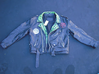
My favorite thing to do at J Y J is paint leather jackets. I was given three to do over the weekend, and here's how they turned out. (all three started out plain, without any paint on them). They will now be fitted with some ungodly amount of pyramid studs put up for sale. Most of the jackets I've done in the past have been more in the vintage motorcycle/hotrod vein than in the punk vein. Below are a few of them. (Note: if you have a jacket you want custom painted, call me!)
Wednesday, July 13, 2011
Ramblin Rex Project Started (Finally)
So I've been owing my buddy Rex Morris a shirt design for his group "Ramblin Rex and the Traumatones" for about a year in exchange for a camera and lenses he gave me last summer. It's taken me FOREVER to get to it, but I started for real today (I've done several thumbnails over the last 9 months, but none of them ever went anywhere). The final will feature a Roth-style character riding a Schwinn Stingray, accompanied by the text of the group's name. So far, I've just completed a sketch of the Stingray. I'll keep posting progress on this as is comes (hopefully it will be complete within 24 hrs.)
Saturday, June 18, 2011
THIS POST IS FOR CLARISSA
Saturday, May 28, 2011
Vincent Price- Work in Progress
In honor of Vincent Price's 100th birthday (May 27), my buddy Shaky and I got together and for a Vincent Price film marathon. While we were watching, he worked on a shirt design of Cousin Eerie driving a 57' Bel Air gasser, and I worked on this:
I'd say it's about 75% done now. As with all of the other paintings I've posted, it's gouache on illustration board. I'll post the final when I finish. Below are the steps, last to first, leading up to the painting: the line transfer onto the illustration board, the tightened up value comp (which I haven't followed all that closely) and the initial sketch. Stay spooky!
I'd say it's about 75% done now. As with all of the other paintings I've posted, it's gouache on illustration board. I'll post the final when I finish. Below are the steps, last to first, leading up to the painting: the line transfer onto the illustration board, the tightened up value comp (which I haven't followed all that closely) and the initial sketch. Stay spooky!
Finished Creature
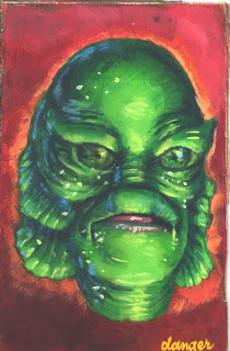
This is the second to last take on the Creature from the Black Lagoon gouache I've been working on for Shaky in exchange for a triumph shirt. I didn't think it looked scary or shiny enough, so I yellowed the eyes, pinkened the lips, darkened some spots and lightened others. The second image below is the result.
Here is the final, slightly more menacing version. I gave it to him tonight.
Here is the final, slightly more menacing version. I gave it to him tonight.
Tuesday, May 17, 2011
Uncle Creature
My buddy Shaky recently airbrushed a shirt with a Robert Williams design of a skeleton riding a custom Triumph that I knew I had to have as soon as I saw it. I told him I'd paint him a Creature from the Black Lagoon for a trade, and he went for it. Below are the initial sketch, a more finalized value comp, the line transfer onto the illustration board, and the Creature as he is now, without eyes and needing some touch up on the mouth and in other areas. I'll post the finished painting soon. (Note: for the Horror sticklers out there, the source image isn't actually technically the Creature from the Black Lagoon, but rather Uncle Gilbert from Munsters episode "Love Comes to Mockingbird Heights." The mask worn in the episode is most assuredly one of the Don Post "Calendar Masks" though, which were cast from the same mold as the one used in the original film.)
Subscribe to:
Comments (Atom)


